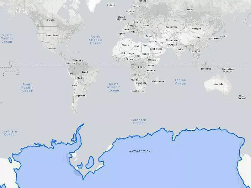
Back in elementary school, you learned about the continents and probably covered some basic geography. The map in your classroom was probably the Mercator projection map, which was first presented in 1569 and has become somewhat standard around the world.
The Mercator map is certainly useful and has been used by navigators and teachers for many years. However, the map has also been lying to you about the true size of countries. This is because it widens things at the poles, distorting land near them and making it appear much larger than it actually is.
Using The True Size Of tool, we’ve compared 12 countries (including the seven largest), two territories and one continent — ordered from smaller to largest— to give you an idea of how big these countries really are.
How the United Kingdom Looks on Most Maps
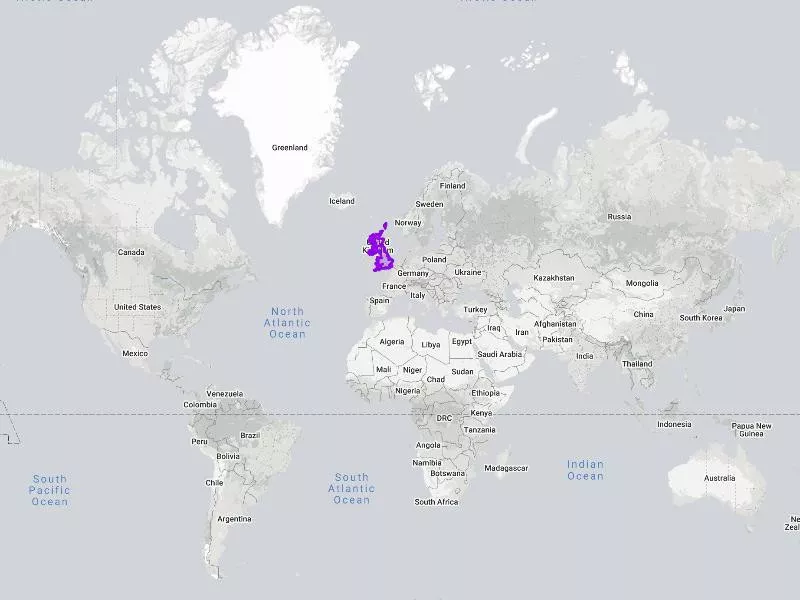
While nobody thinks the U.K. is a large country, it looks much bigger on the Mercator projection.
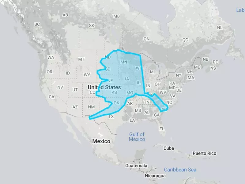
From the looks of it, it could take on most of the Atlantic Coast in the U.S.
How Big the United Kingdom Actually Is
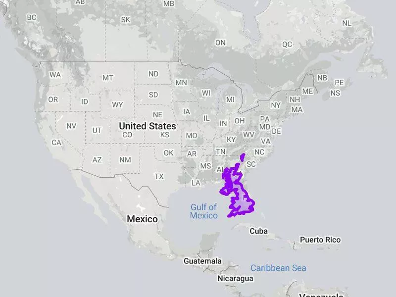
The true size of England compared to Florida. The True Size Of
Size: 93,628 square miles (242,495 square kilometers)
Population: 66.65 million
Capital: London
Comparable country: Ghana
Verdict: United Kingdom
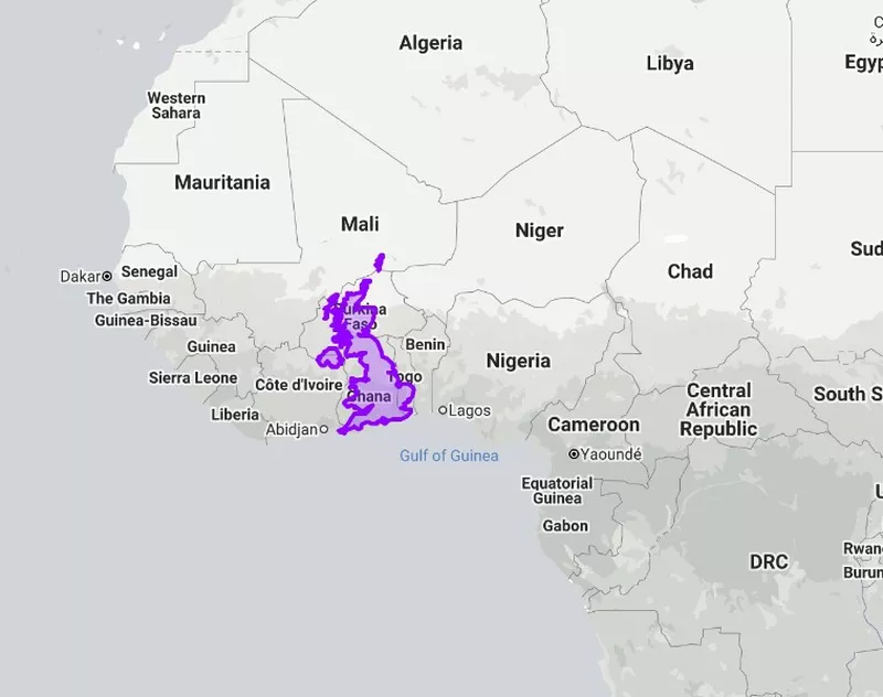
The true size of England compares to Africa. The True Size Of
In reality, the U.K. is about the size of Florida and Georgia or Ghana and parts of Burkina Faso.
The verdict? The country has been lying about its size for centuries and is much smaller than it appears on most maps. It actually ranks 78th globally for land area.
When you consider this, it is almost unfathomable that a country this small managed to subject so many other countries to Imperialism and colonization.
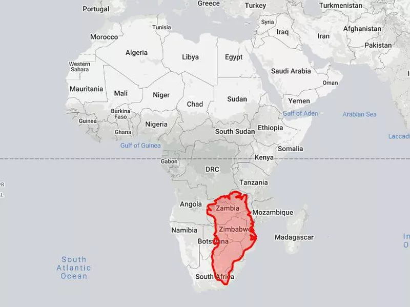
How Madagascar Looks on Most Maps
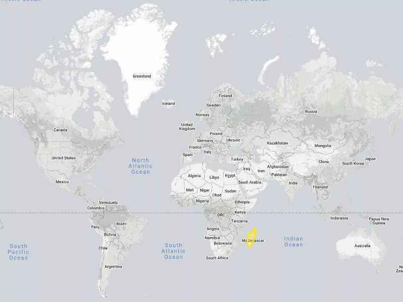
Madagascar looks pretty average on the Mercator projection.
It's certainly not small, but it doesn't look big either.
How Big Madagascar Actually Is
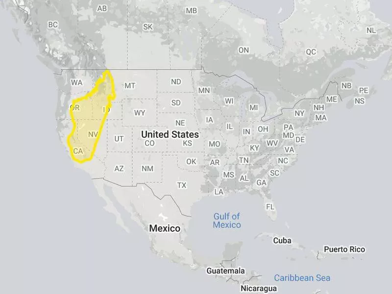
The true size of Madagascar compared to the Western United States. The True Size Of
Size: 226,658 square miles (587,041 square kilometers)
Population: 26.97 million
Capital: Antananarivo
Comparable country: France
Verdict: Madagascar
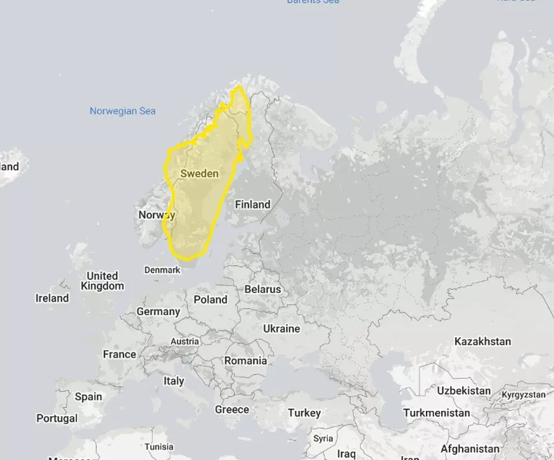
The true size of Madagascar compared to Sweden. The True Size Of
Maps don't give Madagascar enough credit, especially considering it's the second largest island country in the world, after Australia.
At No. 46 in size, the country is larger than a quarter of the world's countries. It is actually slightly bigger than Sweden, despite what maps would have you believe.
How France Looks on Most Maps
France does not look like a big country, but it also doesn't look puny.
It certainly calls attention within Europe, but on the large scale, it's actually quite average.
How Big France Actually Is
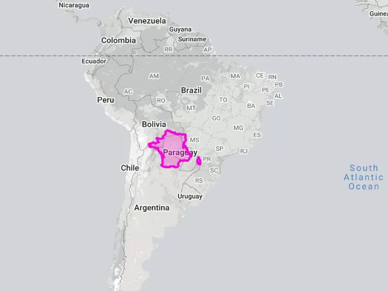
The true size of France compared to South America. The True Size Of
Size: 247,368 square miles (640,679 square kilometers)
Population: 67.06 million
Capital: Paris
Comparable country: Somalia
Verdict: France
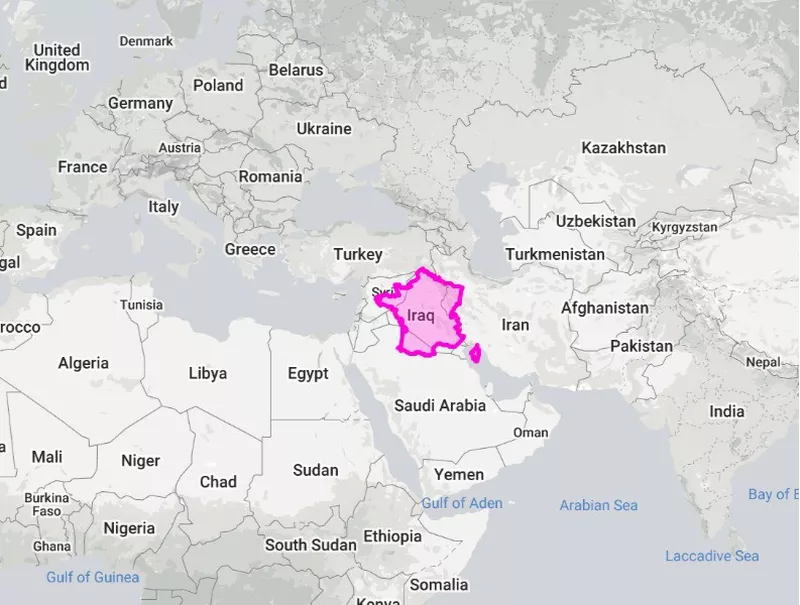
True size of France compared to Iraq. The True Size Of
France is the third largest country in Europe and the largest in the European Union, though part of it has to do with its overseas territories like Guadeloupe and French Guiana. It also ranks 42nd in the world.
However, the verdict is still against France for looking much larger than it is in comparison to countries in the Southern Hemisphere. For instance, the country looks bigger than Colombia, when the latter is actually 107 percent larger. France is more on par with Paraguay.
How Peru Looks on Most Maps
The real size of countries might surprise you. The True Size Of
Situated entirely in the Southern Hemisphere, Peru is another middle-of-the-road-looking country, which most people wouldn't consider too large.
How Big Peru Actually Is
True size of Peru compared to Scandinavia. The True Size Of
Size: 496,225 square miles (1.285 million square kilometers)
Population: 32.51 million
Capital: Lima
Comparable country: Chad
Verdict: Peru
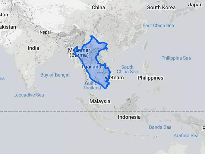
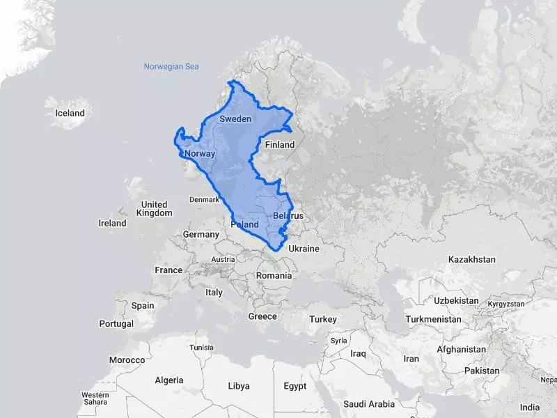
True size of Peru compared to Southeast Asia. The True Size Of
Despite the Mercator doing Peru wrong, the land of the Incas is among the Top 20 largest countries in the world, coming in at No. 19.
Peru could cover most of Norway, Sweden, Latvia and Lithuania as well as parts of Estonia, Poland and Belarus.
It could also cover most of Thailand, Cambodia, Laos, Vietnam and Myanmar combined!
How Greenland Looks on Most Maps
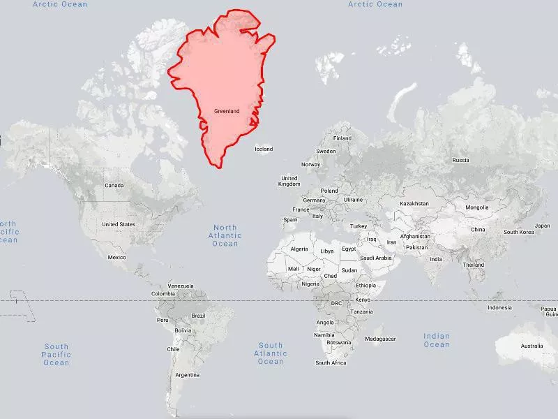
Greenland on the world map The True Size Of
It's almost shocking to see Greenland on a map.
On the Mercator projection, it is absolutely humongous, looking slightly bigger than the entire African continent.
While Greenland is a Danish territory, we're including it independently.
How Big Greenland Actually Is
Greenland's true size compared to Africa. The True Size Of
Size: 836,330 square miles (2.166 million square kilometers)
Population: 56,225
Capital: Nuuk
Comparable country: Saudi Arabia
Verdict: Greenland
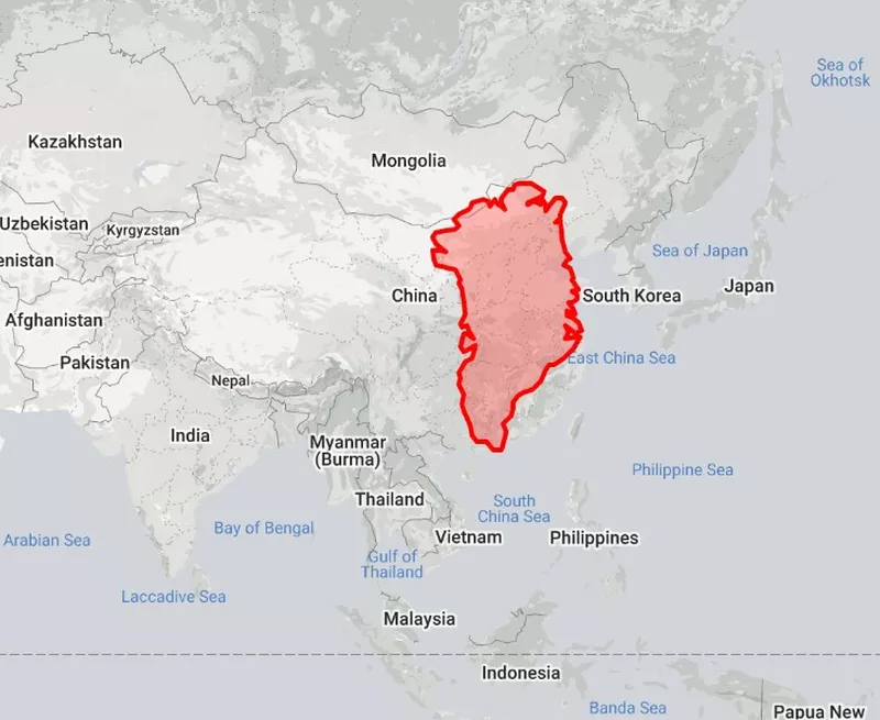
Greenland compared to China The True Size Of
Don't get us wrong, Greenland is certainly impressively large. If it were its own country, it would be the 12th largest in the world. It is also the largest island on the planet.
However, its position near the Arctic has dramatically exaggerated its proportion since it is not, in fact, larger than Africa. Not even close!
How Algeria Looks on Most Maps
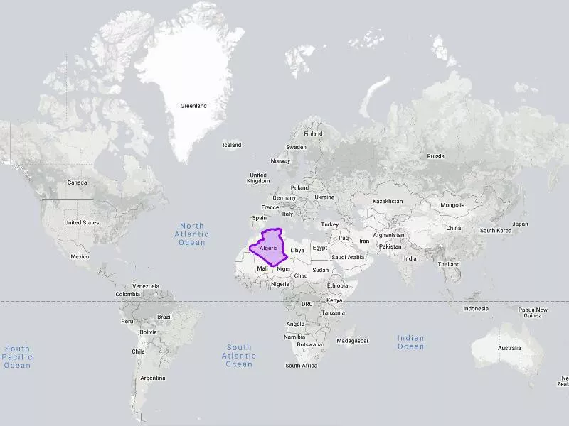
Algeria certainly doesn't look small, but we doubt many people think of it when trying to list the largest countries in the world.
How Big Algeria Actually Is
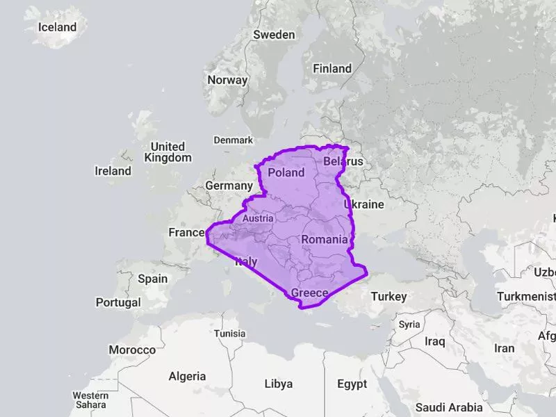
True size of Algeria compared to Europe. The True Size Of
Size: 919,595 square miles (2.382 million square kilometers)
Population: 43.5 million
Capital: Algiers
Comparable country: Democratic Republic of the Congo
Verdict: Algeria
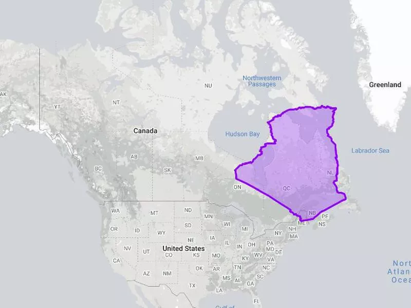
True size of Algeria compared to Canada. The True Size Of
The largest country in Africa, Algeria is also No. 10 in the world.
Again, most people would not include Algeria in the top 10 largest countries, and we want to blame the Mercator for that.
The country is big enough to cover most of the Canadian provinces of Quebec, Newfoundland and Labrador, Nova Scotia, New Brunswick and Prince Edward Island.
How India Looks on Most Maps
India on the world map The True Size Of
Everyone knows India is one of the largest and most populated countries on Earth.
But on the Mercator projection, it looks like it could run from the northern tip to the southern tip of China.
How Big India Actually Is
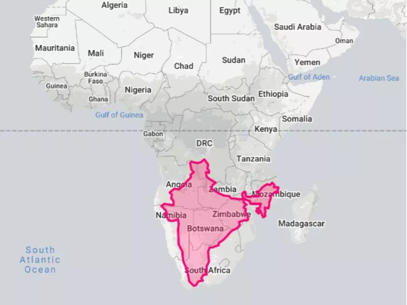
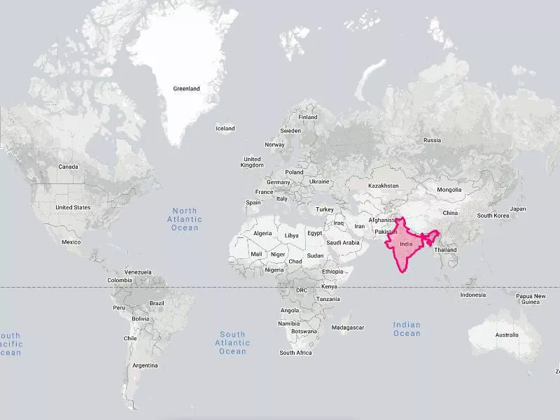
True size of India compared to Africa. The True Size Of
Size: 1.226 million square miles (3.175 million square kilometers)
Population: 1.37 billion
Capital: New Delhi
Comparable country: Argentina and Spain together
Verdict: India
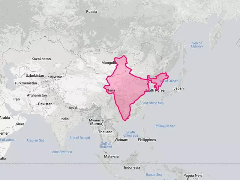
India's size compared to China's size. The True Size Of
Because of its proximity to the equator, India's size hasn't been too distorted.
However, we can see that it is still bigger than it looks on maps, given that it could go from the southern tip of China to the northern tip of Mongolia.
Are we being nit-picky? Maybe, but we want justice for equatorial countries!
How Australia Looks on Most Maps
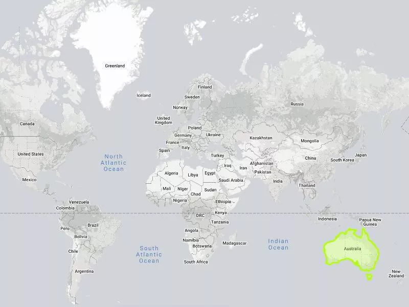
Australia on the world map. The True Size Of
Everyone knows Australia is big, and the Mercator projection certainly makes it seem that way.
But is its size distorted at all?
How Big Australia Actually Is
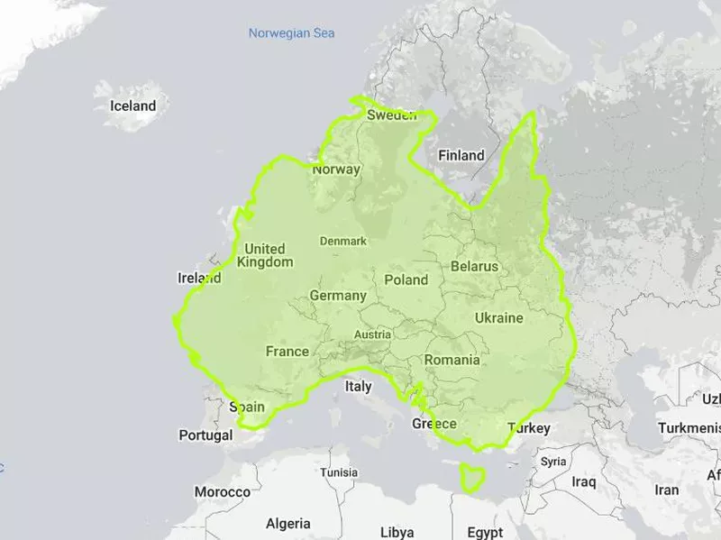
True size of Australia compared to Europe. The True Size Of
Size: 2.970 million square miles (7.692 million square kilometers)
Population: 25.36 million
Capital: Canberra
Comparable country: Two Indias and Thailand together
Verdict: Australia
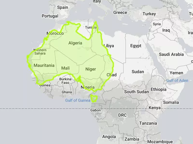
True size of Australia compared to Africa. The True Size Of
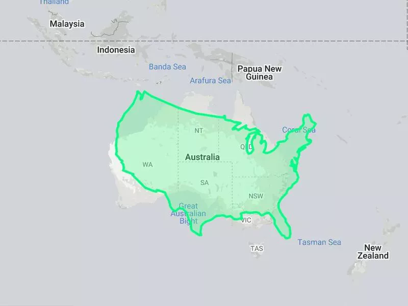
You knew Australia was big, but did you ever think it was big enough to cover almost all of Europe (except Russia)? Or that it could fit two Indias and one Thailand inside of it?
The country is fairly close to the equator, so its size on maps is pretty accurate.
Still, it's shocking to see it compared side by side to other countries. When you see it this way, it's not surprising that it's the sixth largest country in the world.
How Brazil Looks on Most Maps
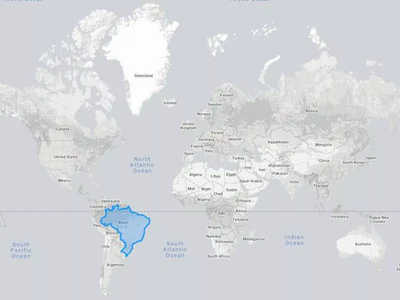
Brazil on a map of the world. The True Size Of
Again, Brazil's reputation as a very large country precedes it.
If we go by normal maps, we'd predict it to be bigger than the U.S.
How Big Brazil Actually Is
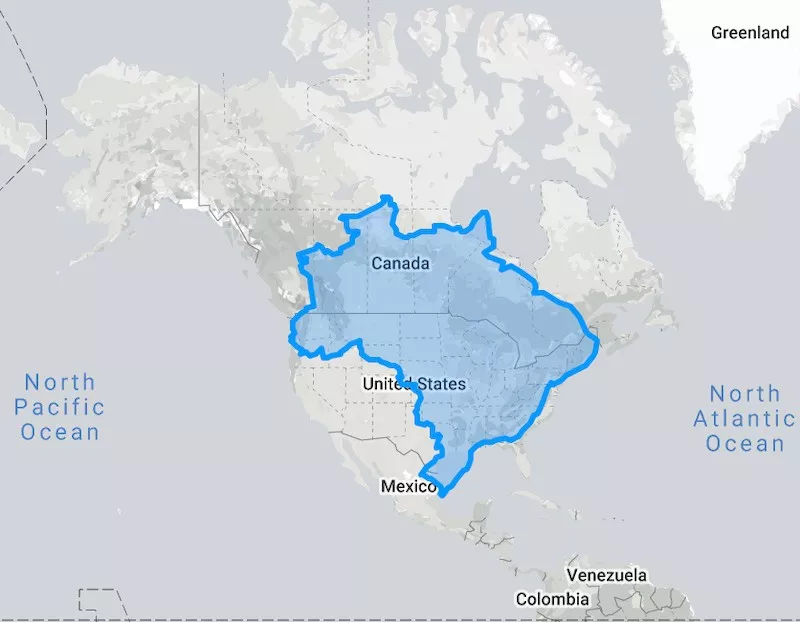
Brazil compared to North America The True Size Of
Size: 3.288 million square miles (8.516 million square kilometers)
Population: 211 million
Capital: Brasilia
Comparable country: The contiguous United States
Verdict: Brazil
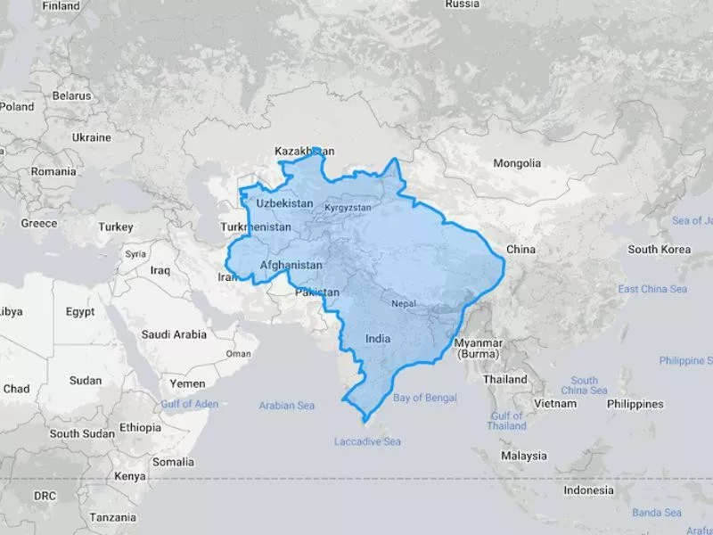
True size of Brazil compared to Asia. The True Size Of
The fifth largest country, Brazil is, in fact, gigantic. It could cover much of the contiguous U.S. and half of Canada! (The U.S. is bigger because of Alaska and Hawaii.)
Its size has not been distorted much since much of it lies firmly along the equator. However, many people would probably still be shocked by its sheer size when compared to other places.
How China Looks on Most Maps
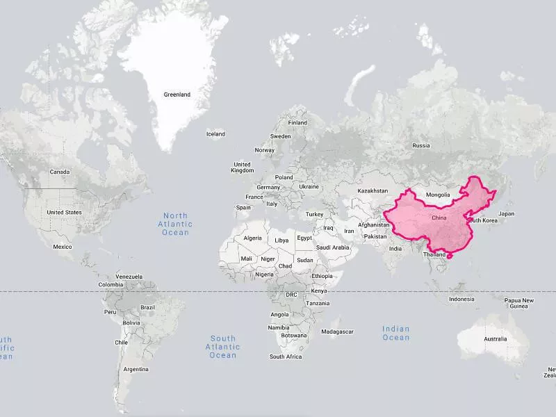
Nobody would ever dare say that China is not a big country. In fact, everyone knows it's gigantic.
On maps, it looks to be about two-thirds the size of Canada, failing to cover the large northern provinces of Nunavut, Northwest Territories and Yukon Territory.
How Big China Actually Is
China's size compared to Canada's size. The True Size Of
Size: 3.705 million square miles (9.597 million square kilometers)
Population: 1.4 billion
Capital: Beijing
Comparable country: United States
Verdict: China
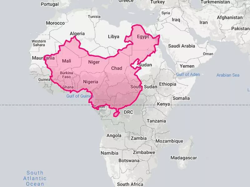
True size of China compared to Africa. The True Size Of
China is both bigger and smaller than it looks. This is because it's above the equator but not near the poles.
When you compare it to, say, Africa, you can see that it covers much of West and Central Africa, but it isn't as relatively big as it looks on maps.
On the flip side, China is only slightly smaller than Canada, at about 96.12 percent of the latter's size. Of course, 4 percent is still significant, but seeing the two countries compared is a good illustration of how much territories are distorted as they get near the poles.
How the United States Looks on Most Maps
Everything in the U.S. is big: the cities, the servings, the houses.
But is the country really as big as it claims to be?
How Big the United States Actually Is
The size of the U.S. compared to Australia The True Size Of
Size: 3.794 million square miles (9.827 million square kilometers)
Population: 328.2 million
Capital: Washington, D.C.
Comparable country: China
Verdict: United States
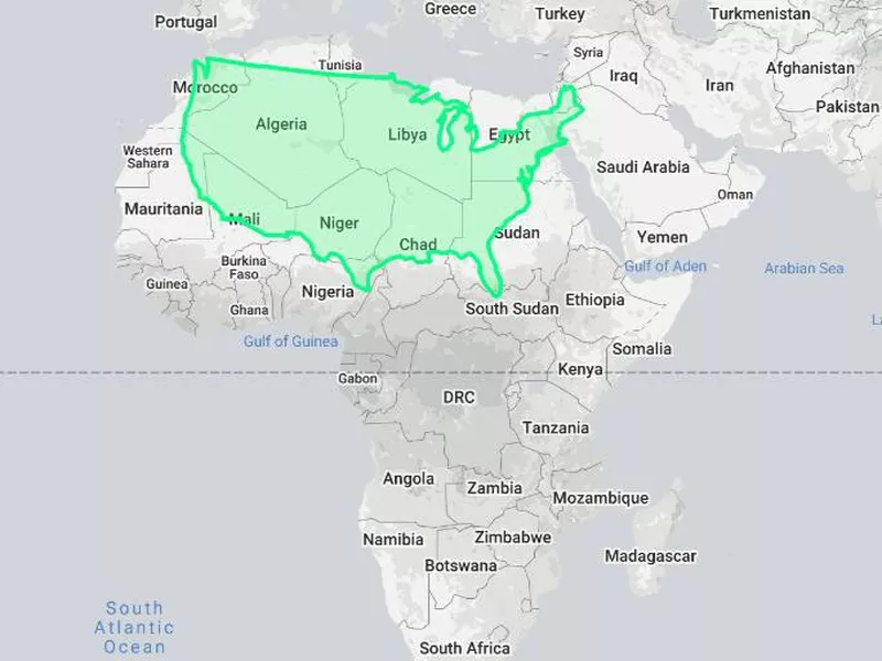
The true size of the U.S. compared to Africa. The True Size Of
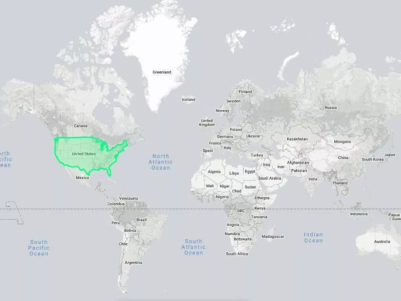
The U.S. is a complicated subject because its ranking is in part due to Alaska (and to a smaller extent, Hawaii).
If you look at the contiguous 48 states, the U.S. is only slightly larger than Australia and, were it not for the other two states, it would be the sixth largest country rather than the third.
How Canada Looks on Most Maps
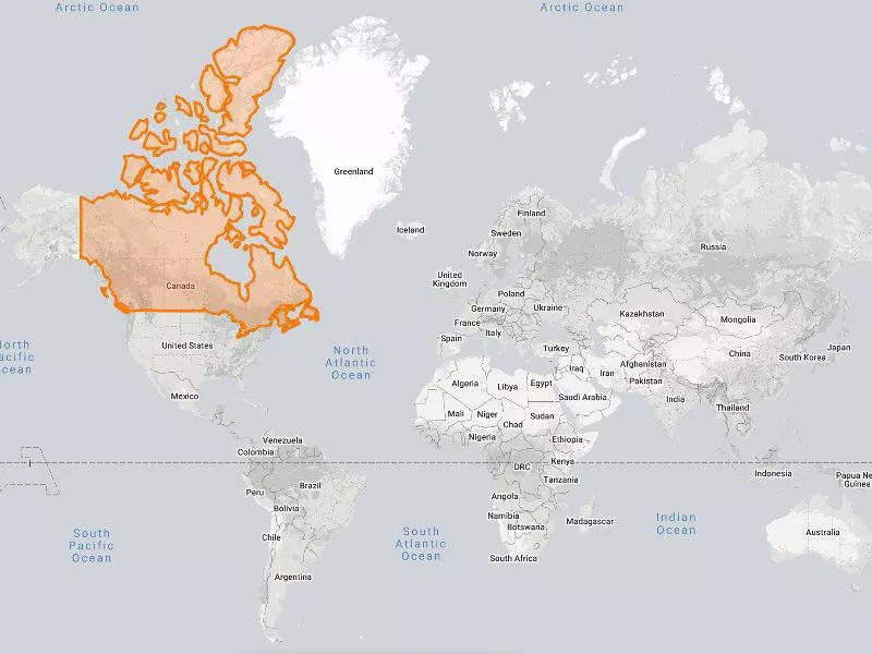
Map of Canada The True Size Of
Canada looks like it would swallow up every other country in the Americas or be big enough to cover the territory between northern Finland and the southern tip of South Africa.
How Big Canada Actually Is
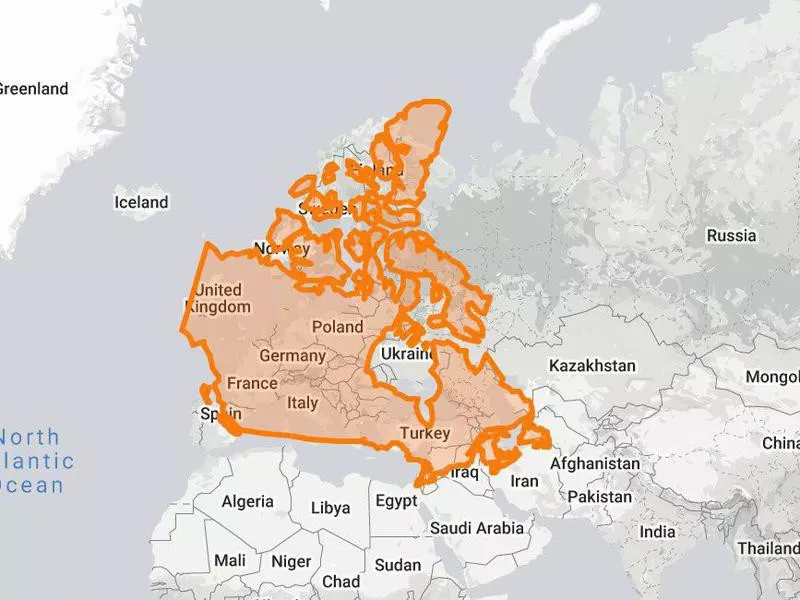
True size of Canada compared to Europe. The True Size Of
Size: 3.855 million square miles (9.985 million square kilometers)
Population: 37.59 million
Capital: Ottawa
Comparable country: United States
Verdict: Canada
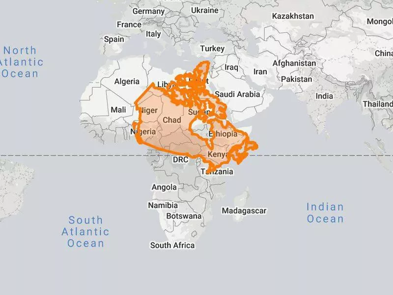
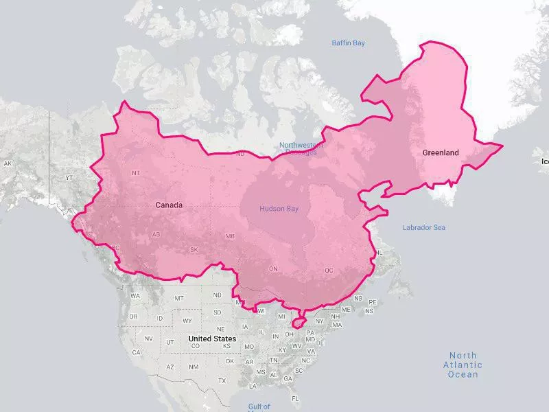
True size of Canada compared to Africa. The True Size Of
Look, Canada really is massive, but its size is grossly exaggerated on maps.
Yes, the country is almost the equivalent of the entirety of Europe and could also cover a large part of Africa. However, unlike the map would have us believe, it would not go from Finland to South Africa.
How Antarctica Looks on Most Maps
Map of Antarctica The True Size Of
The icy continent has no countries or cities but is still worth comparing. Penguins deserve to see how their home fares just as much as we do!
On maps, Antarctica looks like it spans basically the entire width of the world.
How Big Antarctica Actually Is
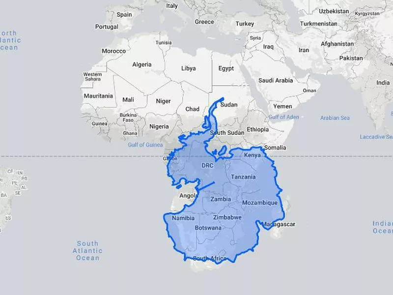
True size of Antarctica compared to Africa. The True Size Of
Size: 5.4 million square miles (14 million square kilometers)
Population: 1,000-5,000
Capital: N/A
Comparable country: 4.3 Indias
Verdict: Antarctica
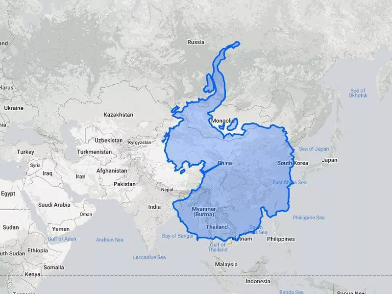
True size of Antarctica compared to Asia. The True Size Of
Of course, Antarctica is the pole, so it makes sense that it is more grossly distorted than any other place. It is also difficult to illustrate something that is at the tip of a sphere on a 2-D map.
However, this logic doesn't stop people from thinking the depiction is accurate and from miscalculating how big the continent really is.
In fact, Antarctica is second only to Russia and would cover a large part of Africa. Compared to its almost mythological proportions on the Mercator projection, it's decidedly underwhelming.
How Russia Looks on Most Maps
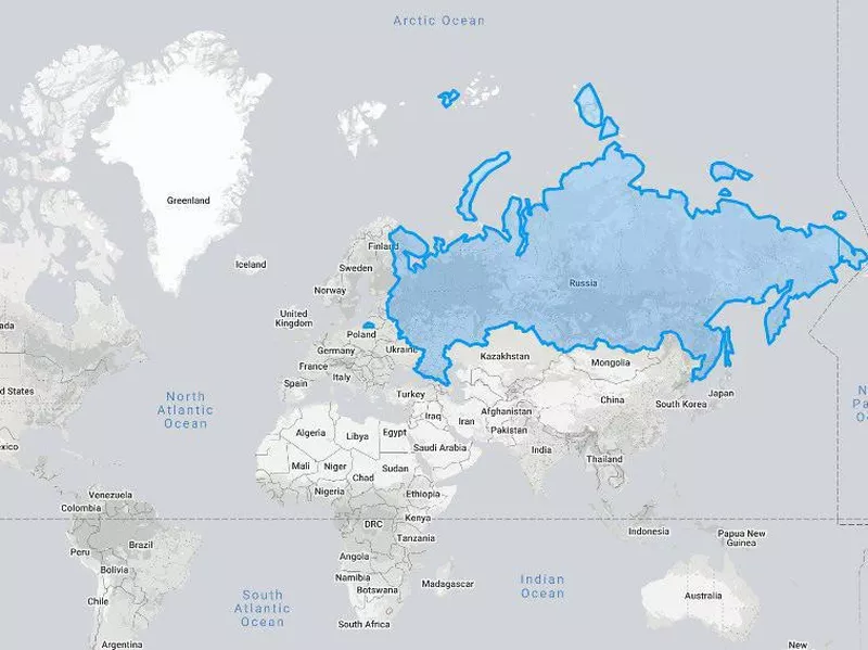
Map of Russia. The True Size Of
Russia looks like — and is — the largest country in the world.
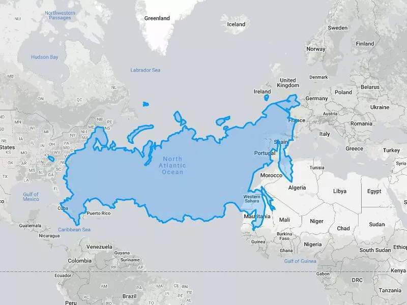
If we were to go by this map, though, we'd believe the country spans an area that would go between the Atlantic Coast of the U.S. to the eastern border of Kazakstan with China.
How Big Russia Actually Is
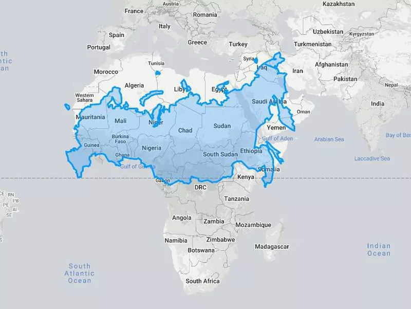
True size of Russia size compared to Africa. The True Size Of
Size: 6.602 million square miles (17.098 million square kilometers)
Population: 144.4 million
Capital: Moscow
Comparable country: Two Brazils
Verdict: Russia
There is no way around it, Russia really is a country of colossal proportions.
The country is so big that it actually contains one-eighth of the entire planet's total landmass. It is also nearly twice as big as Canada and could cover most of South America.
However, its location near the North Pole distorts it, making it seem even more enormous than it actually is. Rather than spanning from the Atlantic Coast of the U.S. to Kazakstan, it would cover the entire Atlantic Ocean as well as the Iberian Peninsula and parts of France, Morocco and Mauritania — still pretty impressive!
Honorable Mention: Alaska
Real size of Alaska on the world map. The True Size Of
Though not a country, Alaska deserves a spot on here because it is worth examining how large it actually is.
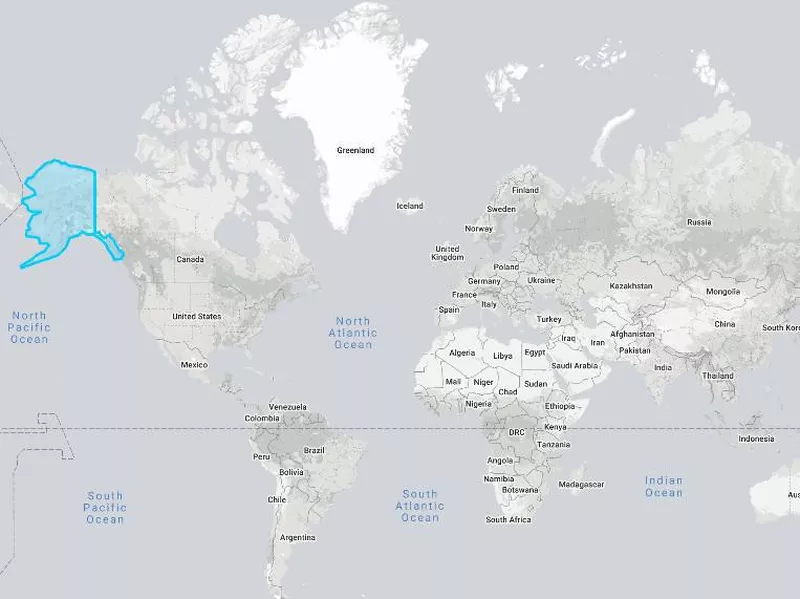
If we go by most maps, Alaska is absolutely huge, looking as if it could cover most of South America.
How Big Alaska Actually Is
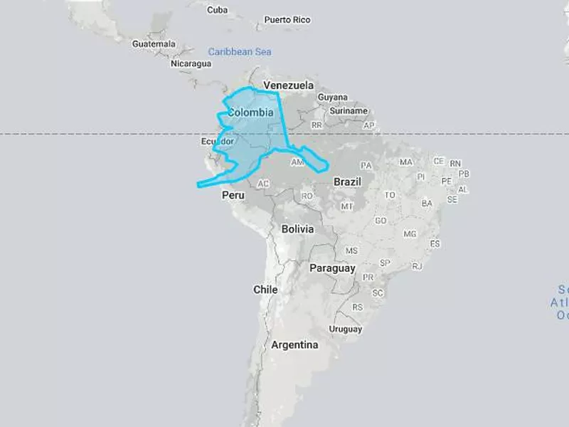
True size of Alaska compared to South America. The True Size Of
Size: 663,267 square miles (1.718 million square kilometers)
Population: 731,545
Capital: Juneau
Comparable country: Libya
Verdict: Alaska
Map showing the true size of Alaska compared to the contiguous United States. The True Size Of
Alaska is definitely lying about its size, but it is still huge!
The state would not cover even half of South America, but it is big enough to go from the south of New Mexico all the way to the Minnesotan border with Canada.
The Land of the Midnight Sun did not have to exaggerate its proportions, so Mercator does it no favors.