Maps feel simple at first glance, but every now and then one forces you to pause and look again. The maps in this list play with scale, shift vantage points, or pull certain details forward so the familiar suddenly looks different. They don’t shout for attention, yet they quietly remind you that a lot of what we assume about the world comes from habit. One small change on a map can unsettle the whole picture.
Half the World Fits in This Circle
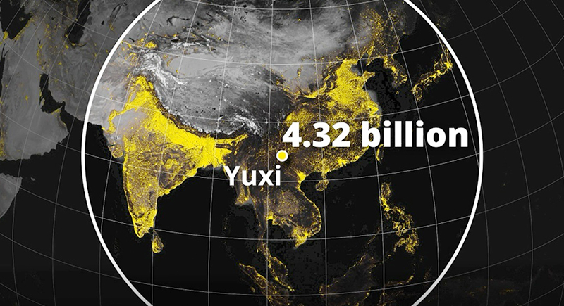
Credit: Instagram
The area inside this circle, centered near Yuxi, China, holds over 4.3 billion people. That’s more than half the global population packed into a small region. The circle covers parts of China, India, Indonesia, Bangladesh, Japan, and a few others. It’s a sharp reminder of how uneven population distribution really is.
A Map That Proves the Saying
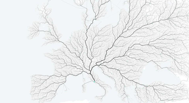
Credit: Reddit
This map shows travel routes that all point to one place: Rome. And no, it’s not just a cute saying. Ancient Roman engineers built over 250,000 miles of roads. Centuries later, the structure still shapes the way people move around the continent. The phrase stuck for a reason.
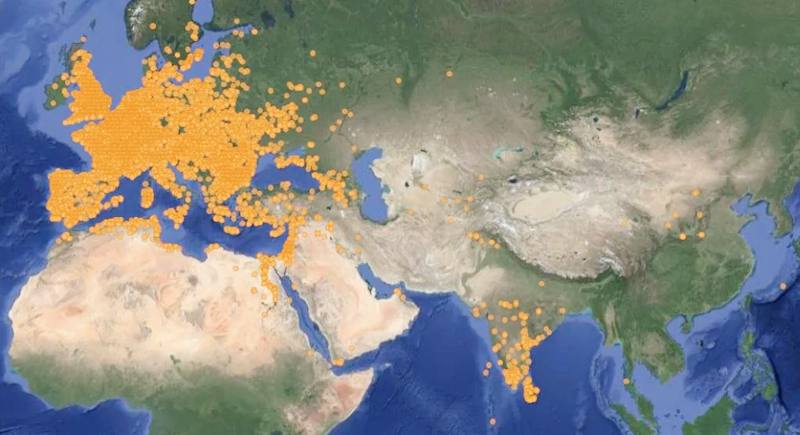
Where Breathing Gets Risky

Credit: Instagram
This heat map tracks global air pollution based on PM2.5 levels, which are the tiny particles that sneak deep into your lungs. The darker red zones show the worst air, with India, parts of China, and northern Africa lighting up the most.
Rome’s Spare Change Ended Up Everywhere
Credit: Reddit
Roman coins appear to have been scattered across half of Europe. From Britain to Syria, these little copper and silver discs traveled far beyond the empire’s borders. Some were used for trade, others lost in battle, or buried for safekeeping and forgotten.
Europe Really Got Around
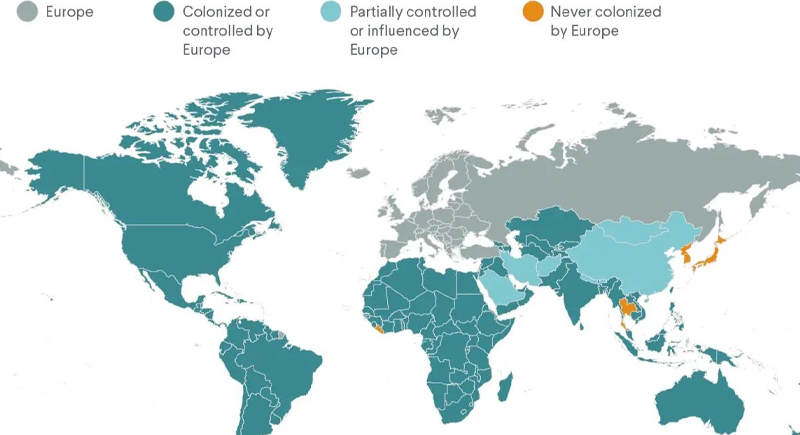
Credit: Reddit
This proves just how far European empires reached. Nearly the entire globe shows signs of colonization, control, or influence. Only a handful of countries—like Japan, Thailand, and Liberia—avoided full European takeover. At its peak, the British Empire alone ruled nearly a quarter of Earth’s population.
If Fish Made the Map
Credit: X
Land turns into scattered islands and the Pacific becomes the main stage. It isn’t incorrect, just unfamiliar. Over 70 percent of Earth is ocean, yet most maps treat it like background. This layout works for showing migration or underwater claims, and it reminds you that land isn’t the default for every species.
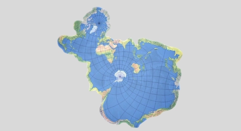
It's a Small World, After All
Credit: Instagram
This map lines countries up by their real land area instead of the stretched outlines we usually see. The Mercator projection is the culprit, since it makes places near the poles look much bigger. Putting everything side by side restores the scale and offers an easy geography refresher for anyone who glances at it.
Two Maps, Two Kinds of Trouble
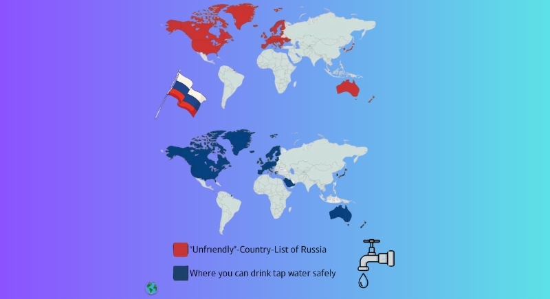
Credit: Instagram
The top map shows the countries that Russia has labeled as “unfriendly,” primarily based on sanctions and political tensions. Below it is a totally different kind of filter. Both maps light up with similar regions, but for wildly different reasons. Either way, if you’re traveling, both lists are probably worth a glance.
Where Trains Rule the Map
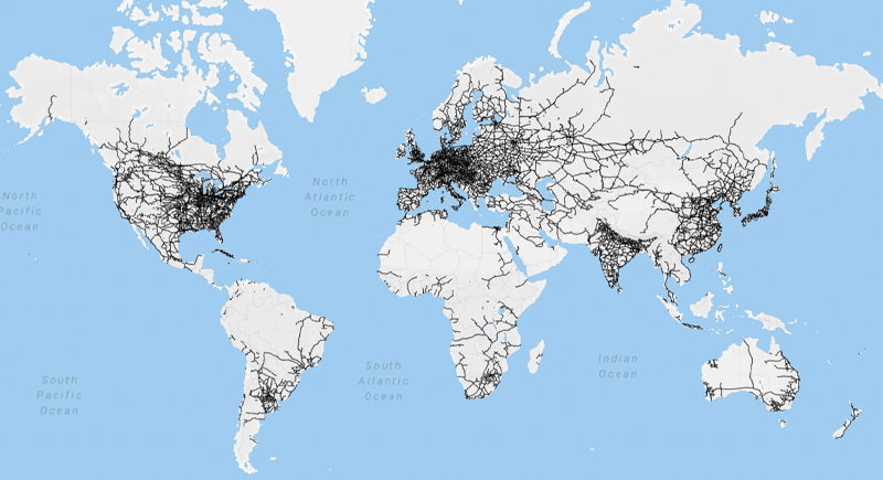
Credit: Wikimedia Commons
This global railway map looks like someone scribbled all over Europe and that’s kind of what happened. Germany, France, and India are especially thick with train lines. Meanwhile, huge areas like Africa, Canada, and Australia are nearly blank. The U.S. has plenty of rails, too, but most are built for freight, not people.
Japan Outranges Korea in Every Direction
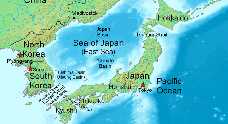
Credit: Wikimedia Commons
It doesn’t look obvious at first glance, but Japan edges out Korea in every direction—north, south, east, and west. The map makes it clear once you line up the farthest points. Japan’s island chain covers more ground than most people realize, curving wide across the Pacific while Korea stays compact.